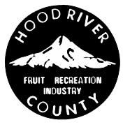
The County Board of Commissioners started the process this week of redoing its logo. With slight regret, we agree the time has come to do away with the old circular black and white. The former logo had certain charms.
Mt. Hood, Cooper Spur and all, will certainly be one element, as Commissioner Bob Benton noted. How we depict our beloved mountain is an essential question. In whatever logo is designed, how much snow do you put on Mt. Hood? Do we idealize our sentinel peak with the 75 percent snow coverage it has historically borne, or are we more realistic about the shrinking of Coe and Eliot glaciers and the greater and greater prevalence or rock faces? Truth in advertising is something to think about, though it is a tough pill to swallow.
The logo is like a business card for the county, an introductory piece to those who might not be familiar with this place. The imagery must work well in black and white for letterhead and other uses, but also in color for social media and other online uses.
The circular one now in use bears the words “Fruit Industry Recreation,” which do sort of look like a run-on phrase. As an early-21st century graphic marker for Hood River, it might be overly quaint, but the logo reminds us of the importance of all three spheres of the local economy. Of course, over the years fruit and recreation have held steady and increased, while “industry” in the 1970s sense has dramatically changed. While timber remains a presence, manufacturing today in Hood River County, in the information age, has a different connotation than the word “industry.”
No one can expect a new logo to accurately represent Hood River for longer than about 30 years — all the more reason to take real care in what the county expresses in the new image. Commissioner Maui Meyer, who knows a few things about windsurfing history, rightly noted that the preliminary logo contains outdated windsurfing gear.
We will always have windsurfing, but one question the county should ask is if that particular triangular representation of local recreation is the best one for a new logo. Kiters and SUP’ers might take issue.
This new logo process is a moment in time and a real opportunity. Input to “Our Readers Write” might help direct the conversation. Send us your brief suggestions of visual elements that the county might put in the logo, with the proviso that the commissioners are right that Mt. Hood is the one essential ingredient — whatever amount of snow you put on it.


Commented
Sorry, there are no recent results for popular commented articles.