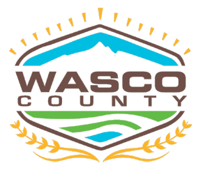
The challenge presented to a team of Wasco County employees in March was to design a logo that represented the vision statement “Pioneering Pathways to Prosperity” and reflected the agricultural and scenic setting of the area.
“We wanted to capture the movement and energy of the county,” said Lisa Gambee, county clerk, who drove the process because of her background in graphic arts.
The county commission put the team to work after strategic planning sessions in early 2016 that revealed at least five different logos being used by departments. The elected board decided there should be a unified logo to symbolize the county’s “identity.”
Joining Gambee at the drawing table were: Angie Brewer, planning director; Juston Huffman, emergency management director who was then with the assessor’s office; Jaime Solars, analyst and technician with the GIS/IT Department; and Kathy White, administrative assistant.
“We had a really good cross section of employees and it was great having all the various perspectives,” said Gambee.
Discussions ensued as composite pictures emerged over how the county would portray its vision statement.
The team decided that the word “Pioneering” didn’t need to be characterized by the traditional wagon image. Instead, they chose the innovative interpretation of the word and focused on an illustration they felt was modern and professional.
“We wanted to show a new and progressive way of doing things,” said Gambee.
The outline of an old-fashioned sheriff’s badge fit the bill because it framed the logo and set the stage to incorporate the next word, “Pathways.”
That word was interpreted as “pointing people in the right direction,” and the team amended the “badge” to also be symbolic of a compass. Directional points at the top of the image were made yellow to double as rays of sunshine to depict positive energy.
Showing “Prosperity” allowed for a wide variety of reflections on quality of life, said Gambee, including lines that indicated water and those that depicted the horizon or, philosophically, the future.
Below the main design is a wheat laurel to once again pay tribute to agriculture as the major economic engine of the county.
Although some members of the team wanted to incorporate cherries into the logo because the fruit is the predominate crop in the county, Gambee said that design element just didn’t work.
“One of the things about logos is that you are never going to please everybody but, for the most part, it was representative,” she said. “We had a cross section of employees and a well-rounded perspective.”
She said design efforts started off with numerous composite sketches that were gradually winnowed by the team to two final choices, which were
presented to employees for a vote.
The winner, by a 48-23 vote, had been fine-tuned by local artist Dixie Lira, who had worked with the team throughout the process.
“I think people ended up liking the final choice because it was a modern representation of logos we’d had before,” said Gambee.
The county commission formally adopted the new logo on June 15.
As departments replace business cards, letterhead and other documents, Gambee said the new logo will be incorporated to avoid additional costs.
Eventually, the design will be exhibited on all signage and paperwork.
“This is obviously a first big step toward getting our identity out there,” said Gambee.
She said once the county’s website, www.co.
wasco.or.us, is revamped, the logo and its colors will be fully displayed.
People are being asked to help with the website project by taking a survey on the home page (click on the icon) about their preference for accessing the site and what features they’d like to see incorporated.


Commented
Sorry, there are no recent results for popular commented articles.